OMICall Officially Changes Its Logo – A New Look, A New Vision
Reading time: 3 minutes
On May 19, 2022, OMICall – the Smart Multi-Channel Call Center – officially changed its logo, marking its 3rd anniversary of establishment and brilliant development.
In particular, with the goal of expanding and elevating its standards, improving service quality, this logo change is considered a “breath of fresh air,” bringing unique and best experiences to customers!
Where did the inspiration for the OMICall logo come from? Let’s find out the meaning now!
What’s different about the OMICall Version 2 colors?

The new logo features refined colors, clearly reflecting the enthusiastic spirit and affirming the strength, dynamism, and relentless efforts of the OMICall team in their journey to continuously improve and upgrade their products/services.
The perfect combination of light blue represents reliability, technological strength, innovation, creativity, and pioneering spirit in the market.
In addition, green, a color always preferred for new features, edits, successful notifications, or valid operations, is used.
Furthermore, the three colors are used in various shades, demonstrating greater flexibility in handling complex layouts and hierarchies.
What does the new OMICall Version 2 logo represent?
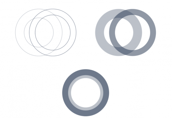
Luôn hướng đến sự tối giản nhưng tinh tế, giống như cách OMICall đồng hành cùng The business offers convenient, easy-to-use features that deliver tremendous results.
Inspired by this, the logo combines two concentric circles of the same size but differing in length and angle.
The circular symbol not only represents the brand (O in OMI) but also implies continuous movement, much like how the OMICall team constantly improves its products to meet user needs and become the solution every business needs.
Furthermore, the circular symbol resembles a ring, suggesting durability, stability, perfection, and infinity.
Finally, the logo uses a 3/4 cross-section of a circle with a large thickness to form the letter C, which is also the first letter of OMI COMPANY, OMICRM, OMICall, OMIContact, etc.
The story of the groundbreaking change in OMICall Version 2
This change in OMICall is an affirmation to customers of its determination and desire to provide the simplest yet most effective experiences.
This is clearly demonstrated by the minimalist yet distinctive design, reflecting the brand’s message to its customers.
The OMI symbol in the logo is not just the brand name; it’s also considered a clever play on words, containing:
OMINI Channel (OMI is taken from Latin and means “all” or “entire”).
OMI also represents three letters: Online – Mobile – Intelligence.
All of these elements show that OMICall version 2 aims to provide businesses with the most comprehensive services!
OMICall Version 2 – “New Look, New Vision” demonstrates the spirit of continuous innovation. The development team has nurtured and launched OMI Version 2 – inheriting features and technologies from the previous version. The new OMICall version updates the UI/UX and design language, with more intuitive, easy-to-use, and transparent features.
In particular, we would like to sincerely thank Mr. Nguyen Ngoc Anh Khoa – who has put so much effort and dedication into creating this new OMICall logo.
Once again, congratulations on the brilliant transformation of OMICall – the Intelligent Multi-Channel Call Center, bringing multi-channel management and communication solutions to businesses. We promise that OMICall will become a trusted partner in helping businesses achieve successful and sustainable digital transformation!
Let’s welcome new breakthroughs and surprises with OMICall Version 2!
VIHAT TECHNOLOGY Co., Ltd
Headquarters: ViHAT Building – 06 Street No. 16 (Him Lam Residential Area) – Hiep Binh Chanh Ward – Thu Duc District – Ho Chi Minh City
Hanoi Branch: Floor 15, LADECO Building, 266 Doi Can, Ba Dinh, Hanoi
Cambodia Branch: Thida Rath #154 St. 33MC, Sangkat Steung Meanchey, Khan Mean Chey, Phnom Penh

-
 What is TikTok advertising? Advertising policies and how it works.
-
 Exploring Conceptual Selling – Understanding Modern Sales Trends Correctly
-
 What is a KOC? Distinguishing between KOLs and KOCs.
-
 What Are Customer Insights? Revealing How to Effectively Uncover Them
-
 What is Digital Marketing? 10 Effective Forms of Digital Marketing
-
 What is Online Marketing? Types of Online Marketing